Color Grading for Photography: Complete Guide to Perfect Color

Color grading is the art of manipulating colors and tones in your photographs to create a specific mood, style, or emotional response. Unlike color correction, which fixes technical issues, color grading is a creative process that transforms ordinary images into visually compelling stories. This comprehensive guide covers everything from fundamental color theory to advanced professional techniques.
Color Correction vs. Color Grading: Understanding the Difference
Before diving into color grading, it's essential to understand the difference between color correction and color grading. Many photographers make the mistake of treating them as the same thing, which leads to suboptimal results.
Color Correction
The technical process of fixing exposure, white balance, and other issues to achieve accurate, natural-looking colors. This should always be done first before any creative grading.
Color Grading
The artistic process of adjusting colors to create a specific mood, style, or aesthetic. This is where you develop your signature look and evoke emotional responses from viewers.
Always complete color correction before starting your grade. Skipping correction can result in unnatural-looking images that are difficult to grade effectively. Think of correction as building a solid foundation before adding the creative flourishes.
Color Theory Fundamentals for Photographers
Understanding color theory is fundamental to effective color grading. The color wheel, developed from Isaac Newton's original red, yellow, and blue model, provides the foundation for all color grading decisions. Great images almost always come down to two things: composition and color.
The Color Wheel and Color Relationships
The color wheel shows relationships between colors that inform grading decisions. The most important relationships for photographers are:
- Complementary colors: Colors directly opposite each other on the wheel (orange/blue, red/cyan, yellow/purple). These create strong visual contrast and are the foundation of popular cinematic looks.
- Analogous colors: Colors adjacent on the wheel that create harmonious, subtle color schemes. These work well for maintaining a natural, unified appearance.
- Split-complementary: A main color paired with the two colors adjacent to its complement. This provides visual interest while maintaining balance.
- Triadic: Three colors equally spaced on the wheel, creating vibrant, balanced compositions.

Color Psychology in Photography
Colors evoke specific emotional responses that you can leverage in your grading:
- Warm tones (red, orange, yellow): Energy, warmth, intimacy, passion. Perfect for portraits and romantic scenes.
- Cool tones (blue, cyan, green): Calm, melancholy, mystery, professionalism. Ideal for corporate work or moody atmospheres.
- Desaturated palettes: Timelessness, sophistication, film-like quality. Popular in fashion and fine art photography.
- High saturation: Vibrancy, youth, excitement. Effective for commercial and lifestyle photography.
Essential Color Grading Tools
Modern editing software provides powerful tools for color grading. Understanding what each tool does and when to use it is crucial for efficient, effective grading.
Software Options
- Adobe Lightroom: Industry standard for photographers with intuitive Color Grading panel and HSL controls. Best for batch processing and workflow efficiency.
- Adobe Photoshop: Offers Camera Raw Filter with all Lightroom tools plus advanced layer-based adjustments and masking.
- Capture One: Professional-grade color tools favored by studio photographers for its superior color science.
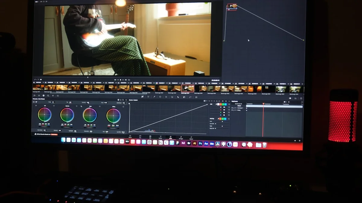
- DaVinci Resolve: Free professional color grading with powerful color wheels, curves, and scopes. Originally designed for video but excellent for photos.
Mastering HSL Adjustments
HSL (Hue, Saturation, Luminance) adjustments allow you to target individual colors without affecting the entire image. This is one of the most powerful tools for precise color grading.
Understanding HSL Components
- Hue: The actual color (what makes red different from blue). Moving the hue slider shifts colors around the wheel. For example, shifting green toward yellow creates a warmer look.
- Saturation: The intensity or purity of the color. Reducing saturation creates muted, film-like tones. Increasing it creates vibrant, punchy images.
- Luminance: The brightness of specific colors. This affects how light or dark individual colors appear, useful for creating separation and depth.
Practical HSL Techniques
Here are specific HSL adjustments for common scenarios:
- Portrait skin tones: Keep orange hue near 0, slightly boost orange saturation, reduce orange luminance for deeper skin.
- Landscape greens: Shift green hue toward yellow for warmth or toward cyan for cooler forest looks. Reduce saturation to avoid overwhelming greens.
- Blue skies: Reduce blue luminance for deeper, more dramatic skies. Shift blue hue toward cyan for a teal look.
- Sunset warmth: Boost orange and yellow saturation, shift red hue toward orange for unified warm tones.

Tone Curves: The Power Tool of Color Grading
The tone curve is arguably the most powerful tool in color grading. It offers precise control over contrast, color balance, and the overall tonal distribution of your image.
Understanding the Tone Curve
The tone curve represents your image's tonal range from shadows (left) to highlights (right). The vertical axis represents output brightness. The diagonal line by default maps input to output directly. Pulling the curve up brightens; pulling down darkens.
RGB and Individual Channel Curves
- RGB Curve: Controls overall brightness and contrast. Creating an S-curve adds contrast by darkening shadows and brightening highlights.
- Red Channel: Pulling up adds red/warmth, pulling down adds cyan. Useful for skin tones and sunset enhancement.
- Green Channel: Pulling up adds green, pulling down adds magenta. Often used to correct color casts or create specific moods.
- Blue Channel: Pulling up adds blue, pulling down adds yellow. Essential for the orange-teal look and split toning effects.
Classic Curve Techniques
- Lifted Blacks: Raise the bottom-left point of the curve to create a matte, film-like look where shadows never reach pure black.
- Crushed Highlights: Lower the top-right point for a vintage look where highlights don't reach pure white.
- S-Curve: Create an S shape for added contrast. Keep it subtle (10-15% adjustment) to maintain natural appearance.
- Cross-Processing: Use individual RGB curves to create color shifts. Classic example: lift blue in shadows, drop blue in highlights.

Split Toning and Color Grading Panels
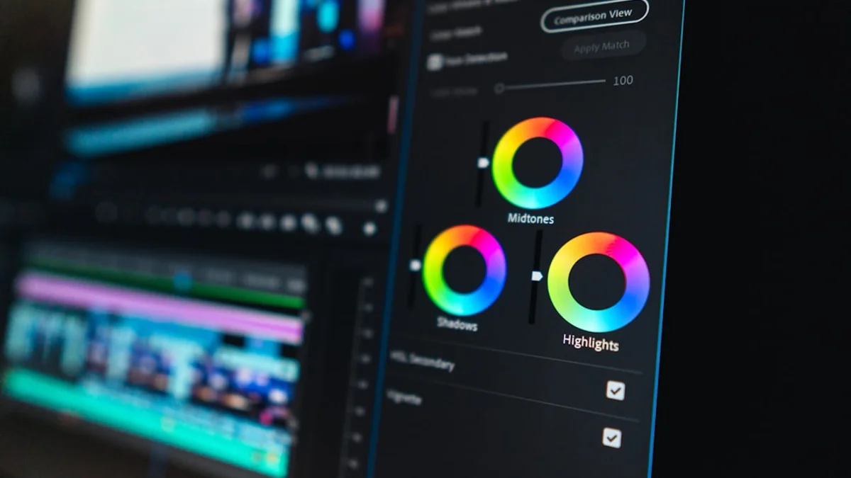
Split toning adds different colors to the highlights and shadows of your image, creating sophisticated color palettes. Lightroom's Color Grading panel (which replaced Split Toning) offers three color wheels for shadows, midtones, and highlights, plus a global adjustment.
How Split Toning Works
The technique is simple in concept: push one color into shadows and a different color into highlights. The magic happens when you choose complementary colors that enhance each other.
Popular Split Toning Combinations
- Warm highlights + Cool shadows: Yellow/orange in highlights, blue in shadows. Mimics golden hour light against cool shade. Natural and pleasing.
- Cool highlights + Warm shadows: Blue in highlights, orange in shadows. Creates a unique, sometimes unsettling mood. Used in thriller films.
- Teal + Orange: The classic Hollywood look. Teal in shadows, orange in highlights. More on this below.
- Purple + Yellow: Dramatic and attention-grabbing. Popular in music photography and creative portraits.
Using the Color Grading Panel
- Start with shadows: Build your foundation by adding color to shadows first. Keep saturation low (10-20) to avoid overdone looks.
- Add highlights: Choose a complementary color for highlights. The combination should feel unified, not jarring.
- Adjust midtones: Use sparingly. Midtones affect skin tones heavily, so be careful with portrait work.
- Use Blending and Balance: Blending controls how colors overlap. Balance shifts the emphasis between shadows and highlights.
The Orange and Teal Look: A Deep Dive
The orange and teal color grade has dominated cinema and photography for over a decade. Understanding why it works and how to achieve it properly will elevate your grading skills.
Why Orange and Teal Works
- Complementary colors: Orange and teal sit directly opposite on the color wheel, creating maximum visual contrast that's inherently pleasing to the eye.
- Skin tone separation: Human skin falls in the orange spectrum. Pushing teal into shadows makes skin tones pop and separates subjects from backgrounds.
- Golden hour simulation: The combination mimics warm sunlight against a blue sky or cool shadows, creating a natural yet enhanced look.
- Unified palette: Despite using only two main colors, the look unifies diverse images into a cohesive, cinematic series.
How to Achieve the Orange and Teal Look
Follow this step-by-step process for a professional orange and teal grade:
- Start with properly exposed, color-corrected images. White balance should be neutral.
- In the Color Grading panel, add teal to shadows (hue around 200-210, saturation 15-30).
- Add orange to highlights (hue around 30-45, saturation 10-25).
- In HSL, shift blue hue toward cyan (-15 to -25) and reduce blue saturation.
- Shift orange hue slightly toward red (+5 to +15) for warmer skin tones.
- Reduce overall saturation by 10-20% for a more cinematic, muted feel.
- Add a subtle S-curve for contrast and slightly lifted blacks.
When to Avoid Orange and Teal
This look isn't appropriate for everything. Nature documentaries, certain portrait styles, and images where accurate color is important (products, real estate) should avoid heavy color grading. The look works best for action, drama, portraits with environmental context, and creative commercial work.

LUTs Explained: Presets for Professional Color
LUTs (Look-Up Tables) are mathematical formulas that transform colors in your images. They map original color values to new values, applying complex color grades instantly.
Types of LUTs
- Technical LUTs: Used for color space conversion (like LOG to Rec. 709). Essential for video but less common in photography.
- Creative LUTs: Apply artistic color grades. These are what most photographers use for achieving specific looks quickly.
- Film Emulation LUTs: Recreate the color science of specific film stocks like Kodak Portra, Fuji Pro 400H, or cinematic film stocks.
Using LUTs Effectively
- Always color correct first: LUTs assume neutral starting points. Applying a LUT to an uncorrected image produces unpredictable results.
- Reduce LUT intensity: Most LUTs look best at 50-70% strength. Full strength often looks overdone.
- Customize after applying: Treat LUTs as starting points. Adjust exposure, contrast, and individual colors after application.
- Match your subject: Different LUTs suit different content. A moody film LUT won't work for bright commercial product photography.
LUTs vs Manual Grading
LUTs are tools, not replacements for understanding color grading. Learning to grade manually first helps you customize LUTs effectively and creates grades that LUTs can't replicate. Use LUTs for speed and consistency, but develop your manual skills for creative control.
Professional Color Grading Workflow
A consistent workflow ensures quality results and efficient processing. Follow this professional approach:
Step 1: Import and Cull
Import your images and select the best ones before any editing. Don't waste time grading images you won't use.
Step 2: Color Correction
- Set correct exposure using the histogram
- Adjust white balance for neutral whites
- Set black and white points to utilize full tonal range
- Fix any color casts
Step 3: Creative Grading
- Apply your base grade (preset, LUT, or manual)
- Adjust HSL for targeted color changes
- Fine-tune with curves for contrast and color shifts
- Apply split toning/color grading
- Add any finishing touches (vignette, grain)
Step 4: Batch Processing
Lightroom excels at batch editing. Develop your look on one image, then sync settings across similar images. This ensures consistency and saves significant time.
Step 5: Local Adjustments
After global grading, use masking for local adjustments. Brighten faces, adjust specific areas, or apply different grades to different parts of the image.
Common Color Grading Mistakes to Avoid
- Skipping color correction: Starting creative grading without proper correction leads to inconsistent, unnatural results.
- Over-saturation: Beginners often push saturation too high. Cinematic looks are typically muted, not vibrant.
- Destroying skin tones: Heavy grading can make skin look unnatural. Always protect skin tones with HSL adjustments or masks.
- Applying the same grade everywhere: Different lighting conditions require adjusted grades. Don't blindly apply one preset to everything.
- Crushing blacks completely: Lifted blacks create a film look; crushed blacks look digital and harsh.
- Over-editing: Know when to stop. The best grades are often subtle. Toggle before/after to check you haven't gone too far.
- Ignoring the histogram: Let scopes and histograms guide your decisions. Don't clip highlights or crush shadows unintentionally.
- Following trends blindly: Develop your own style rather than copying whatever's popular. Trends fade; personal style endures.
Advanced Color Grading Techniques
Color Harmony Through Limitation
Professional colorists often limit their palette to 2-3 main colors. This creates unity and visual sophistication. Use HSL to desaturate colors outside your chosen palette.
Zone-Based Grading
Apply different grades to different luminosity zones. Shadows, midtones, and highlights can each receive distinct color treatments for complex, layered looks.
Film Emulation
Study actual film stocks to recreate their characteristics: Portra's creamy skin tones, Fuji's muted pastels, Kodak Gold's warm nostalgia. Understanding what makes each film unique helps you recreate or create similar looks.
Matching Grades Across Images
For consistent series: develop your grade on a neutral exposure image first. When applying to other images in the series, adjust exposure to match before applying the grade, then fine-tune.
Developing Your Signature Color Style
The ultimate goal of learning color grading is developing your unique visual signature. Here's how to find your style:
- Study work you admire: Analyze the color choices in images and films you love. What colors dominate? What's the contrast like? How saturated are they?
- Experiment regularly: Try different approaches. You'll discover preferences through practice.
- Create custom presets: Once you find looks you love, save them. Refine them over time as your style evolves.
- Maintain consistency: A recognizable style comes from consistent choices across your work.
- Break rules intentionally: Once you know the rules, break them deliberately for creative effect.
Color grading is both technical skill and artistic expression. Master the tools, understand the theory, but always let your creative vision guide your choices. The best color grades serve the image and the story you're telling, enhancing without overwhelming.
