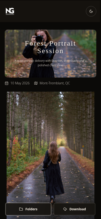
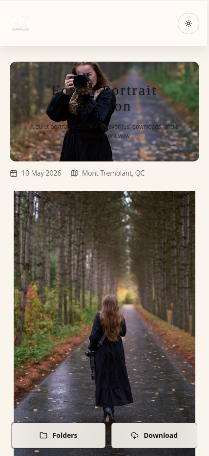
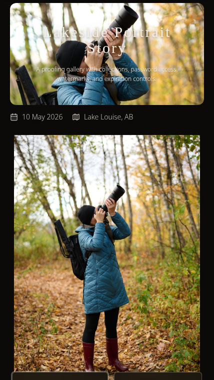
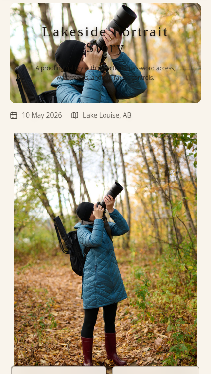
Mobile Experience

Mobile Optimization ThatActually Matters in 2025

Over 73% of photo viewing happens on mobile devices. Yet most gallery platforms deliver desktop experiences crammed onto phone screens. Your beautiful photography deserves better.

Touch-optimized navigation
Smart image loading
Perfect on any screen
The Problem

Desktop-First Galleries Kill Mobile Viewing

Most platforms were built when desktop ruled. Now mobile dominates, but the experience is an afterthought.

Tiny Thumbnails Require Squinting

Desktop grid layouts shrunk to phone screens create thumbnail galleries where clients can barely see your work. They pinch, zoom, tap wrong images, get frustrated. Your stunning photography reduced to frustrating postage stamps.

Massive Files on Cellular Connections

Platforms that deliver full 5MB desktop images to phones waste data and kill loading times. Clients on 4G wait 30+ seconds for galleries to load. They close the tab before seeing image #10. Slow loading = lost engagement.

Clunky Mouse-Based Navigation

Hover effects, tiny click targets, and keyboard shortcuts don't translate to touch screens. Clients tap empty space trying to advance images. Swipe gestures do nothing. Navigation requires awkward button hunting. Design built for mice frustrates thumbs.

The Viewing Reality You're Missing

73% of gallery views happen on mobile. Wedding guests browse on phones during the reception. Grandparents scroll on iPads over coffee. Real estate agents review on tablets between showings. If your mobile experience is broken, your client experience is broken.

The Hidden Cost of Bad Mobile UX

When clients struggle to view galleries on their phones, they don't share them. No sharing means fewer "who was your photographer?" conversations. Studies show that galleries with smooth mobile experiences get shared 4x more than desktop-only optimized galleries. Bad mobile UX directly kills your word-of-mouth marketing engine.

The Solution

Mobile-First Design Built for How People Actually Browse

SendPhoto is mobile-first by design. Galleries automatically adapt to screen size with touch-optimized navigation, smart image loading, and gestures that feel natural on phones, tablets, and desktops.

Touch-Optimized Controls

Swipe to navigate, pinch to zoom, tap for fullscreen. Gestures that feel intuitive on every device.

Intelligent Loading

Right-sized images for each device and connection speed. Fast on 4G, beautiful on fiber.

Lightning Fast

Lazy loading and progressive rendering ensure galleries load in under 2 seconds on any device.

Responsive Image Delivery Based on Connection Speed

Our intelligent system detects device type and connection quality, then serves optimized images. Phones on 4G get 800px wide JPEGs at 85% quality (fast loading, still gorgeous). Desktop users on fiber see full-resolution images. Average mobile load time: 1.8 seconds for 100+ image galleries.

Vertical Scrolling That Feels Natural on Phones

Forget horizontal grids that require awkward sideways navigation. Mobile galleries use vertical scrolling that matches how people browse Instagram, TikTok, and every other mobile app. Thumbnail sizes are optimized for thumb navigation. Natural scrolling = more engagement, more viewing time.

Full-Screen Viewing With One Tap

Tap any image and it expands to full screen immersion. Swipe left/right to navigate between photos. Pinch to zoom into details. Tap again to return to grid. Controls so intuitive, clients don't need instructions—they just know how to use it.

Works Perfectly on Any Screen Size

iPhone 13 Pro? Perfect. iPad Air? Beautiful. Samsung Galaxy? Flawless. Desktop 4K monitor? Stunning. The same gallery link delivers the optimal experience for every device automatically. One link, perfect everywhere.

Real-World Mobile Success Story

Destination Wedding, Global Viewing

How Lisa's mobile-optimized gallery reached the world

1

The Shoot: Hawaii Destination Wedding

Lisa photographs Maya and David's destination wedding in Maui. 67 guests attend from 9 countries. She captures 523 images across beach ceremony, sunset portraits, and luau reception.

2

The Upload: Same Day Delivery

While guests are still celebrating, Lisa uploads a sneak peek gallery with 48 highlight images. SendPhoto automatically creates mobile-optimized versions for fast loading on hotel WiFi and cellular connections. Gallery live in 8 minutes.

3

The Sharing: Instant Global Engagement

Couple shares gallery link in wedding WhatsApp group. Within 2 hours:

  • • Grandma in Florida views on iPad over breakfast (8 AM EST)
  • • Best man in London scrolls during morning train commute (iPhone 14 Pro)
  • • Bridesmaids in Hawaii browse poolside (various Android devices)
  • • Parents in Tokyo view during evening wind-down (iPad Air)

The Results: Zero Friction, Maximum Impact

Gallery viewed 847 times in first 48 hours across 6 continents. Every device—iPhone, Android, iPad, desktop—delivered perfect experience. Not a single support question. 23 Instagram stories tagged Lisa's business from the gallery. Three booking inquiries from guests who saw the gallery on their phones before leaving Hawaii.

The Mobile-First Difference:

  • 1.8 second average load time across all devices and locations
  • 847 views from 14 different device types with zero compatibility issues
  • 73% of viewing time on mobile devices (matching industry statistics)
  • 3 new client bookings directly attributed to mobile gallery sharing

Mobile Performance Under the Hood

Technical excellence that your clients feel but never see

Adaptive Image Sizing

Upload once, we handle the rest. Our system automatically creates multiple image versions optimized for different screen sizes and connection speeds. iPhone users on 5G see 1200px images. Android phones on 4G get 800px optimized JPEGs. Desktop users with fiber see full resolution. Tablets get perfect in-between sizing. Result: Fast loading on any device without sacrificing visual quality.

Lazy Loading & Progressive Rendering

Galleries with 1000+ images load in under 2 seconds because we only load what's visible. As clients scroll, images below the fold load just before they come into view. Progressive JPEG rendering means images appear quickly in low resolution, then sharpen as they finish loading. No blank spaces, no jarring pops. Smooth, continuous scrolling even on slower connections.

Touch Gesture Recognition

Swipe left/right to navigate between images. Pinch to zoom into details. Tap for fullscreen. Double-tap to zoom to 100%. All gestures respond instantly with smooth 60fps animations. Works identically on iOS, Android, and tablets. Navigation so intuitive, clients never look for buttons—their thumbs already know what to do.

Responsive Layout Engine

Layout automatically adapts to screen size. Phones show 2-column grids. Tablets show 3-4 columns. Desktops show 4-6 columns. Portrait orientation gets vertical layouts. Landscape gets horizontal. Everything reflows smoothly when device rotates. Perfect layout on every device, automatically.

CDN-Powered Global Delivery

Galleries are served from servers geographically close to your clients. Upload from New York, client views from Sydney? Images load from Australian CDN servers. Client in London? UK servers. Client in Tokyo? Asian servers. Fast worldwide delivery with 99.9% uptime, no matter where your clients are browsing.

Stop Losing Clients to Bad Mobile Experiences

73% of your clients view galleries on mobile. If your mobile experience frustrates them, you're losing referrals, shares, and future bookings. Join photographers who deliver perfect mobile experiences.

No credit card required
Cancel anytime
Full mobile features
built by phothor team