
The shoot is finished. The edits are exported. The client is waiting. What seems like a simple final step, putting a photo gallery on a website, is often where presentation and delivery start to drift apart.
A portfolio gallery and a client gallery aren't doing the same job. One needs to attract, persuade, and reflect a brand. The other needs to help a specific person review, select, download, and share images without friction. When photographers treat those as the same problem, they usually end up with a gallery that looks decent but works poorly.
Choose around the intended audience, files and action. A public portfolio and a private handoff can use the same service, but they need different content and access rules. A photo-volume statistic cannot establish which setup fits your studio.
A smart gallery choice starts with one question. What job does this gallery need to do?
Table of Contents
- Your Guide to Website Photo Galleries
- What Is a Website Photo Gallery Really
- Comparing the Four Main Gallery Approaches
- Design and UX Best Practices for Galleries
- Optimizing for Performance SEO and Accessibility
- Essential Security and Privacy Controls
- Your Decision Framework and Next Steps
Your Guide to Website Photo Galleries
A wedding photographer finishing a gallery for a couple faces one set of problems. A commercial photographer updating a homepage portfolio faces another. Both are building a photo gallery on a website, but the success criteria are different.
The public portfolio has to win trust quickly. It has to show taste, consistency, and a point of view. It needs strong sequencing, clean presentation, and enough structure that a potential client can move from “these photos look good” to “this is the right photographer for the job.”
The private client gallery has a more practical role. It has to help someone find their images, mark favorites, share with family or a team, and download the right files without confusion. Security matters more here. So do delivery controls, folder structure, and mobile usability.
A gallery that attracts new work isn't always the gallery that delivers finished work well.
That distinction affects almost every decision after it. Layout, access rules, branding, file organization, and download options all flow from the gallery's primary use.
Photographers often start by asking which plugin or platform has the longest feature list. That's usually the wrong starting point. A shorter list of features matched to the right job beats a bloated setup that's hard to maintain and awkward for clients to use.
A useful way to think about it is this:
- Public portfolio: Built for discovery, trust, and inquiries.
- Private client delivery: Built for review, handoff, and control.
- Hybrid gallery: Built for studios that need both, usually with separate workflows behind the scenes.
What Is a Website Photo Gallery Really
A website gallery isn't just a page with thumbnails. It's a presentation system, and its design should follow its purpose.
For a public-facing site, the right analogy is an art gallery. The photographer curates the work, controls the sequence, and shapes what the visitor notices first. The gallery's job is selective display. It should feel edited, not exhaustive.
For client delivery, the better analogy is a private viewing room with a secure back office. The client isn't there to admire curation alone. They need practical tools. They need to sort, compare, favorite, and download. A beautiful front end still matters, but usability becomes part of the product.
Use photographs and explanatory text together: images show the work, while headings, captions and instructions explain the project and next action. Avoid treating a general memorability statistic as evidence for a particular gallery design.
Two jobs, two design priorities
A portfolio gallery usually needs:
- Tighter curation: Fewer images, stronger sequence.
- Brand cohesion: Consistent crops, spacing, and typography.
- Narrative flow: Strong opening images and clear category paths.
A delivery gallery usually needs:
- Broader coverage: Enough images for review, not just highlights.
- Fast retrieval: Clear folders, selections, or searchable groupings.
- Controlled access: Permissions that match the client relationship.
Where photographers get stuck
The most common mistake is trying to force one gallery to do both jobs equally well. A minimalist portfolio grid can feel elegant, but it may frustrate a wedding client who needs family portraits, ceremony coverage, and reception candids organized into sensible sections. A utility-first delivery gallery can work perfectly for handoff, but it may feel clunky on a homepage meant to impress an art director.
Working rule: Treat the gallery as part of the client experience, not just a container for exported files.
That mindset makes tool selection easier. Instead of asking which option has more features, ask which one supports the experience the visitor needs.
Comparing the Four Main Gallery Approaches
There are four common ways photographers build a photo gallery on a website. None is universally right. Each one solves a different mix of branding, control, setup time, and maintenance.
The comparison below uses the same four approaches as the section headings. It lists possible uses and responsibilities, not star ratings, measured speed or universal feature limits.
The quick comparison
| Approach | Possible use | What it can offer | What to verify |
|---|---|---|---|
| CMS gallery or plugin | Public portfolio and site pages | Publication within an existing site and editing workflow | Actual gallery controls, theme compatibility, image delivery and ongoing updates |
| Embedded or hosted gallery | A hosted display linked from or embedded in a site | Provider-managed gallery hosting | Embedding support, branding, loading, accessibility, access rules and provider terms |
| Dedicated client delivery platform | Review and delivery for a defined audience | Purpose-built organization, selection or download controls where provided | Exact controls and formats, audience separation, retention and integration with the public site |
| Fully custom build | Specific requirements not met by available tools | Design and behavior implemented for the requirements | Ownership of development, hosting, authentication, accessibility, updates and backups |
CMS plugins
A CMS may already have a native gallery, so a plugin is not always necessary. For example, WordPress documents its Gallery block: add it with the block inserter or /gallery, then add images and configure the available gallery settings. Columns, captions, cropping and link options should be reviewed for the page. This is a documented route, not a WordPress setup we performed for this article.
Consider this route for portfolio pages, journal posts and categories such as weddings, brands, interiors or travel. Verify any client-selection, access or download features separately; a CMS label alone does not establish them.
Pros
- Direct control over site design
- Easier to keep everything under one domain
- Useful for marketing pages, blog content, and portfolios
Cons
- Plugin conflicts and theme updates can break layouts
- Large galleries can become heavy fast
- Privacy, proofing and delivery capabilities must be checked for the actual setup.
A native gallery or suitable plugin may be enough for public presentation. Compare actual features and maintenance rather than assuming all plugins have limited privacy or that an extra plugin is always needed.
Embedded and hosted galleries
This approach uses a third-party gallery host and embeds it into an existing site, or links visitors out to the hosted gallery. It reduces setup work, but it introduces trade-offs around consistency and control.
Hosted galleries can be fine for archives, personal projects, or low-maintenance display. They're also useful when the main website builder has weak native gallery options. The problem appears when the embedded experience feels visually disconnected from the rest of the site.
Linking to a hosted gallery and embedding it are different arrangements. Verify that the provider permits embedding; do not assume every share URL works inside an iframe. Compare a clearly labeled direct link when embedding is unsupported or makes navigation difficult.
Public display tolerates some friction. Paid delivery usually doesn't.
Public Website Markup Example
For a public page you own, this proposed pattern shows where your real image file, descriptive alternative text, dimensions and caption belong. Replace the path, dimensions and description with your own permitted content. It is a single-image pattern, not a private gallery or completed website build.
<figure>
  <img src="/images/public-portrait.jpg"
       alt="Portrait photographer holding a camera on a forest path"
       width="1440" height="1000" loading="lazy">
  <figcaption>Portrait session example used with permission.</figcaption>
</figure>
The example belongs below the first important visible image. The path and caption are placeholders for your own public content; do not place a private client share URL or password on this page. Link recipients to their agreed delivery through a separate invitation.
Dedicated client delivery platforms
This category exists for photographers who need a gallery to do more than show images. It needs to deliver finished work, preserve control, and reduce email back-and-forth.
These platforms typically support password protection, sharing links, download permissions, and organizational tools that make large shoots easier to manage. That matters for weddings, school photography, sports, events, and commercial approvals.
SendPhoto is our product and one delivery option. Its online photo-gallery hosting guide explains collections, favorites and sharing decisions. Compare actual controls with the assignment, including whether a separate gallery is needed for each audience.
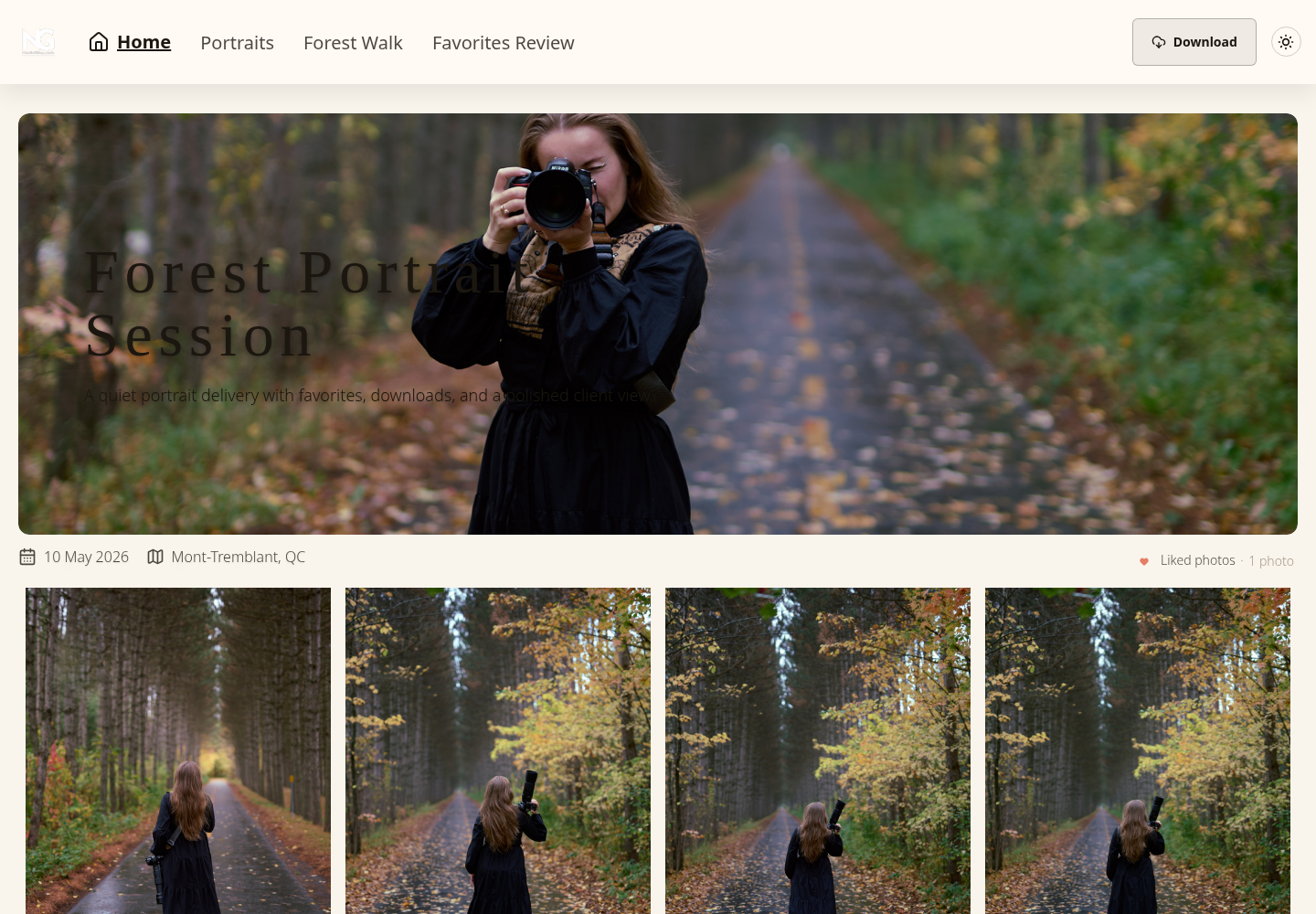
Best fit Studios that regularly send finished galleries to clients and need a cleaner handoff than cloud-drive links.
Trade-off The strongest delivery tools may live slightly outside the main website stack, so branding and integration deserve attention during setup.
Fully custom builds
A custom gallery can be the right answer when a studio has very specific needs. That might mean unusual layouts, advanced filtering, custom licensing workflows, or integration with an internal archive.
Custom code gives the most control over design and behavior. It also creates the most responsibility. Someone has to maintain it, test changes, handle performance issues, and keep the experience polished across devices.
This option is rarely the first recommendation for solo photographers unless the site itself is a core business asset and the owner is comfortable managing a more technical stack.
What actually works in practice
Use the following starting points, then confirm the actual features and responsibilities:
- Choose a CMS plugin when the main need is a public portfolio.
- Choose hosted or embedded galleries when speed of publishing matters more than deep customization.
- Choose a delivery platform when clients need secure access, organized downloads, and a cleaner review process.
- Choose custom code only when standard tools block a real business requirement.
A gallery should remove work, not create more of it. If the photographer has to explain how to use it every time, it's probably the wrong setup.
Design and UX Best Practices for Galleries
Good gallery design doesn't start with decoration. It starts with reducing hesitation. A visitor should know where to click, what they're looking at, and how to move through the work without thinking about the interface.
Choose a layout that matches the work
Grid layouts are dependable. They work well for portraits, product work, headshots, and any collection where consistency helps the images read as a set.
Masonry layouts can suit editorial, travel, or mixed-aspect work, but they need restraint. If every tile has a different shape and visual weight, the gallery can feel busy before the photos have a chance to speak.
Fullscreen and edge-to-edge presentations can look strong for nature scenes, architecture, and fine art work. They're less effective when clients need to compare many similar frames quickly.
A few practical rules help:
- Use uniform crops when the goal is polish and consistency.
- Let aspect ratios vary only when the variation supports the story.
- Avoid over-styling captions and overlays if clients need to review efficiently.
Review the set for intentional color and editing consistency. Different displays can render colors differently; a consistent-looking gallery is not proof of calibrated output. For editing and exports, see the photo-editing workflow guide. Keep independent originals and final exports.
Make navigation effortless
The best galleries feel almost invisible. Clients shouldn't hunt for download buttons or wonder whether they're viewing one set or an entire shoot.
Useful navigation patterns include:
- Clear collection names: “Ceremony,” “Family Formals,” and “Reception” beat vague titles.
- Visible actions: Favorites, select, share, and download should be easy to find.
- Predictable movement: Arrows, swipe gestures, and close buttons should behave the way people expect.
Navigation should disappear into the task. If clients notice the interface too much, it's getting in the way.
For larger jobs, organization matters as much as layout. A wedding gallery benefits from chronological sections. A commercial gallery often benefits from product line, campaign, or usage-based grouping. School and sports galleries usually need team, athlete, or event segmentation.
Keep brand control subtle
Choose branding that identifies the studio while leaving images and controls legible. Logos, watermarks and background treatments should support the task; this is a design judgment, not a measured effect on trust.
A cleaner approach works better:
- Keep the logo visible but modest.
- Use typography that stays readable on mobile.
- Match the gallery colors to the site without forcing every page into a dark or stylized theme.
- Leave enough white space around images so the work carries the visual weight.
A polished photo gallery on a website should feel branded, but it shouldn't feel branded at the expense of usability.
Optimizing for Performance SEO and Accessibility
A gallery can look refined and still fail in the browser. Slow image delivery, weak alt text, and inaccessible controls make the experience worse for clients and harder for search engines to understand.
Inspect image dimensions, actual encoded bytes and the loading strategy separately. Pixel dimensions alone do not establish file size or Core Web Vitals. Alt text is a separate accessibility decision; it does not certify performance.
Performance starts with image handling
Images can contribute substantially to a gallery’s payload, but scripts, layout and server responses also need attention. Measure your actual page rather than inferring speed from its category.
A solid image workflow usually includes:
- Responsive derivatives: Serve smaller files to smaller screens instead of one oversized master to everyone.
- Modern formats: Use WebP or AVIF where the setup supports them.
- Lazy loading: Hold below-the-fold gallery items until the visitor scrolls toward them.
- Intentional hero choices: The first visible image often drives perceived speed, so it needs careful sizing.
For a public page you control, prepare appropriate display files. A hosted delivery service may generate previews from uploaded originals; check its processing policy instead of assuming full-size uploads are always wrong. Keep independent masters and make the intended final download available separately.
MDN’s image-element reference explains dimensions and lazy loading. Give images width and height to reserve their aspect ratio. Lazy loading can defer below-the-fold images; avoid using it indiscriminately on the first important visible image. Responsive sources need real exported variants, not just smaller CSS display sizes.
For photographers who want to improve search visibility alongside gallery structure, this guide to SEO for photographer websites is a useful companion resource.
SEO and accessibility use many of the same habits
Choose alt text for the image’s purpose. A meaningful photograph needs a concise contextual description; a purely decorative image can use empty alt text. An image functioning as a link or button needs text conveying its action or destination. Follow the W3C alt-text decision tree, rather than adding promotional keywords to every image.
Other habits matter too:
- Use descriptive filenames before upload.
- Keep gallery URLs readable instead of relying on random strings when possible.
- Make controls keyboard-friendly so users can move through the gallery without a mouse.
- Label buttons clearly so screen readers can identify actions like close, next, previous, favorite, and download.
For the public portfolio, Google’s image guidance covers HTML images, relevant surrounding text and responsive sources with a fallback src. Keep private delivery and permission-sensitive files out of the public portfolio; SEO settings are not authentication.
Test the gallery like a client would
The following is a proposed check for your own website using non-sensitive content, not a test we performed. Include the devices and assistive technologies your visitors use.
A practical test pass should include:
- Open the gallery on mobile over a normal cellular connection.
- Tap through the first images and check whether the first screen feels quick.
- Try favorites, browsing, and download actions with one hand.
- Operate by keyboard on desktop.
- Run a screen reader pass on the main controls.
Fast, searchable, and usable beats visually impressive but fragile every time.
Essential Security and Privacy Controls
Security choices shape trust. That's true for private client work, family sessions, school events, commercial proofs, and any gallery that contains unreleased or personal images.
Publish a public portfolio only with appropriate rights and permission. For client work, choose access according to the audience, sensitivity and agreement. Payment alone does not determine whether a shared link is appropriate.
What needs protection
Some risks are obvious. Uninvited viewers access a gallery. A link gets forwarded too widely. A client downloads files that weren't meant for final use. Proofs circulate without context.
Other risks are quieter. Galleries stay live long after a project ends. Download permissions remain broader than intended. A photographer loses track of who has access to what.
Record the intended audience, downloadable versions, review deadline and independent retention decision. A secure connection protects transport; it does not decide who may open a forwarded link or capture displayed content.
The controls that matter most
The most useful protections are simple and client-friendly.
- Password protection: A basic first layer for private delivery.
- Expiring links: Helpful when access should end after review or delivery.
- Download controls: Useful for separating proof access from final high-resolution delivery.
- Watermarks: Best used selectively for proofs, not as a substitute for access control.
- Organization and audience separation: collection names help navigation but are not automatically access rules. Use separate galleries or suitable authenticated access where audiences differ.
Check what each setting changes. Shared passwords can be forwarded and do not establish identity. Disabled downloads do not prevent capture of viewable content. Share expiry is separate from deletion and cannot recall files recipients already obtained. Favorites are preferences, not formal approval or publication permission.
In SendPhoto, downloads depend on global and collection settings. Original with watermarking can use a generated marked image, and ZIP downloads include permitted collections. Sharing expiry closes sharing; the self-delete schedule is separate. Keep required originals and final exports independently.
For photographers comparing secure sharing options, this resource on password-protected photo galleries gives a practical look at what those controls are meant to solve.
Security is part of delivery quality. Clients notice when access feels considered and under control.
Your Decision Framework and Next Steps
A gallery decision usually gets easier once the job is clear.
A public portfolio and a private client gallery solve different problems. One needs to present taste, consistency, and a clear point of view. The other needs to help a client review, select, approve, and download files without confusion. Problems start when photographers try to force one setup to do both jobs equally well.
For archives, decide which metadata supports your own retrieval and which should be removed from public files. Exposure, aperture, focal length and ISO can be useful in an internal editing record; location, names and visible private details need separate review. Metadata is not an access rule.
Use these nine questions to plan the gallery:
- Purpose: what should this gallery accomplish?
- Audience: who visits, with which devices and connection needs?
- Skills: who can configure and maintain the chosen setup?
- Budget: which development, hosting and provider costs apply?
- Time: who owns initial setup and ongoing administration?
- Growth: how will more images and jobs affect the setup?
- Access and backup: what controls and independent copies are needed?
- Accessibility: can visitors use the content and controls?
- Maintenance: who handles updates, failures and eventual exit?
A simple decision checklist
- Choose portfolio-first if the gallery's main job is winning inquiries and showing how you see.
- Choose delivery-first if the recurring job is client review, selection, approval, and file handoff.
- Choose hybrid if both matter, but keep the public-facing portfolio separate from the private delivery workflow.
- Choose custom only when an off-the-shelf tool blocks a real process in your business, not because custom sounds more professional.
The first setup steps
A practical rollout usually looks like this:
- Pick the gallery type based on the primary job it needs to do.
- Prepare suitable public display files or the delivery service’s supported inputs. Keep masters independently and distinguish previews from intended final downloads.
- Group work into collections, folders, or proof sets that match how clients review images.
- Apply access settings that fit the assignment, such as passwords, expiration dates, or proof watermarks.
- Test the gallery on phone and desktop, then click through it as if you were the client.
- Send one clear link and add instructions only where the handoff is not obvious.
That last step matters. If a client has to ask where to favorite images, how to download finals, or whether relatives can view the gallery, the setup is doing extra work for you instead of saving it.
Decide whether this gallery presents permitted public work, delivers files to an agreed audience or supports both through separate workflows. Then compare the exact controls with that decision. Explore SendPhoto and its gallery-delivery features if its collections, favorites, optional passwords and download settings fit your handoff.