
A mixed media gallery can bring photographs and video from one assignment into a clear client handoff. Start with the viewing or selection task, choose compatible exports, organize the project into collections and configure access and downloads. Keep working files and backups separately.
Table of Contents
- What Is a Modern Mixed Media Gallery
- Translating Physical Curation to Digital Galleries
- Choosing the Right File Formats and Media
- Designing an Intuitive Client Viewing Experience
- Delivering Secure and Branded Mixed Media Projects
- Conclusion From File Dump to Curated Experience
What Is a Modern Mixed Media Gallery
Here, a mixed media gallery means a client presentation containing photographs and video items from the same project. Organize them around the viewer’s task: review a story, select images or download approved assets. Text can supply context through a gallery or collection description, or be rendered into a supplied image or video when needed; do not assume a platform has separate audio or text-slide uploads.
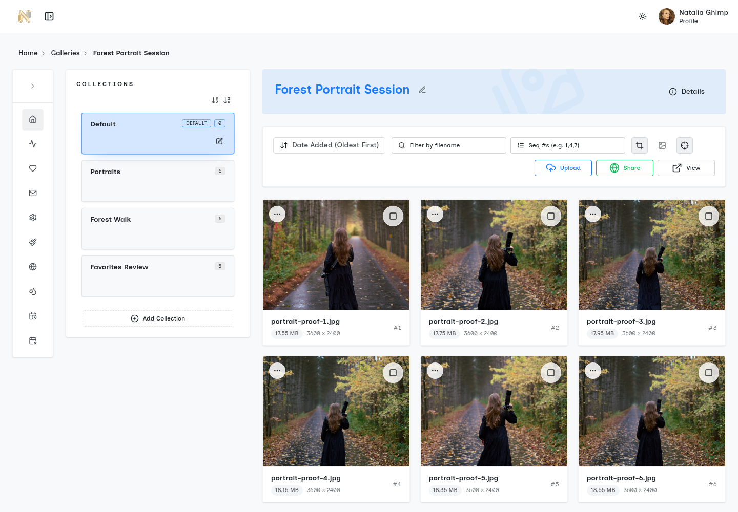
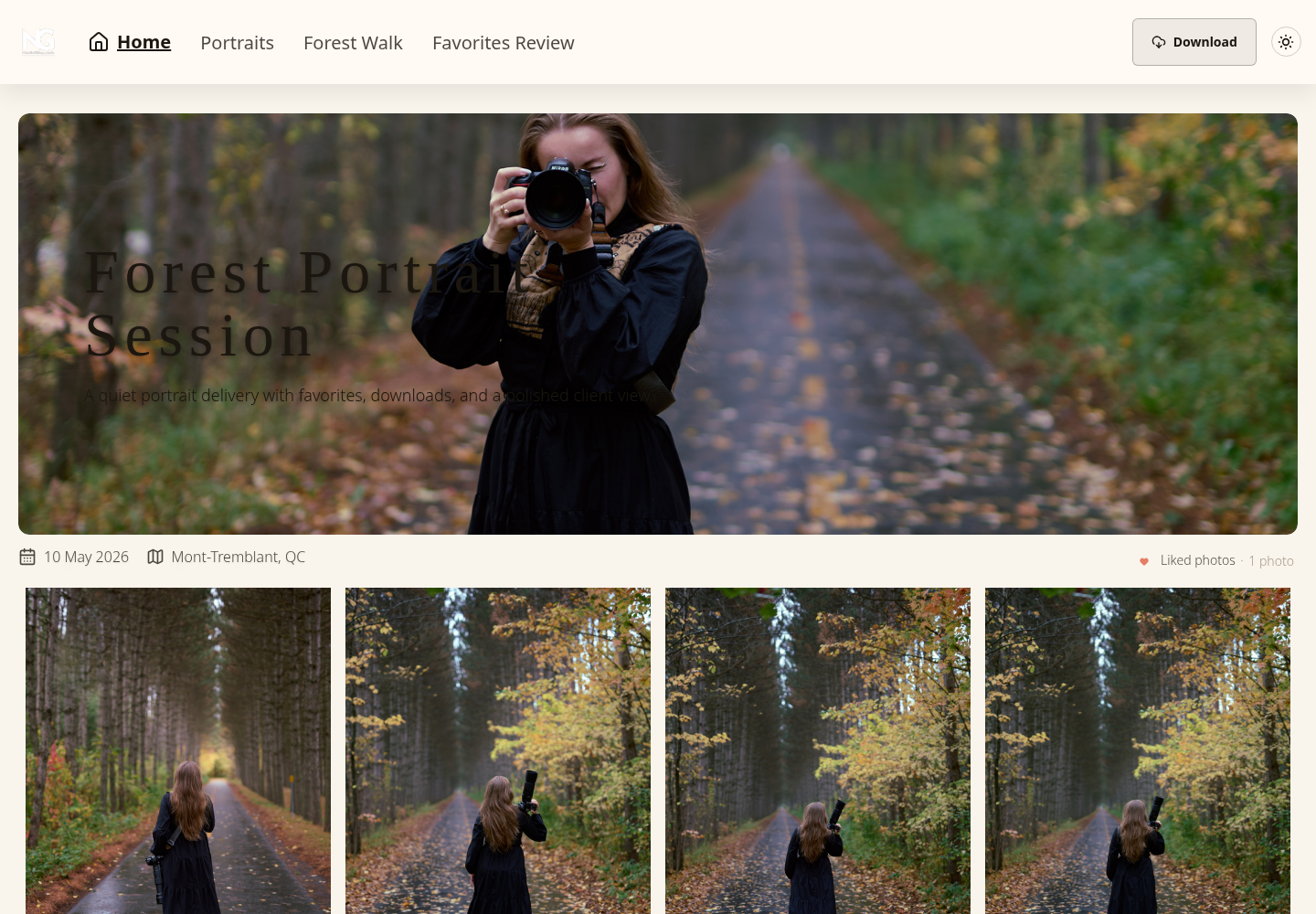
SendPhoto supports photo and video gallery items. Its video viewer uses a browser player with controls and a poster image. Actual playback still depends on the uploaded file, browser and network. The screenshots below show existing still-photo demo galleries and their organization, not a video playback test.
Why the term matters
The term can also describe artwork made with different materials or a physical exhibition. This guide uses it for digital client handoff. A physical wall’s hanging height does not become a screen setting, and art-market sales statistics do not demonstrate how a client will use a photo gallery.
Choose the media that carries useful information. A still may show a product clearly; a clip may show its movement. A collection description can explain the assignment. Keep sound in a supported video file if it belongs in the presentation, rather than promising an audio-only gallery feature.
What clients actually experience
Agree the review task with the client instead of assuming every viewer wants the same presentation.
- Continuity: keep related moments in clearly named collections.
- Variation: include motion when it adds information, with a useful still preview.
- Presentation: provide a coherent selection and clear instructions without promising a measured change in perceived professionalism.
- Review: explain how selections should be recorded and confirmed.
For general delivery context, see online galleries for photographers. This article focuses on sequencing a mixed project rather than comparing providers.
The real shift in mindset
Plan three outputs separately: the selected client presentation, the agreed deliverable files and the independent working archive. They may overlap, but none automatically replaces the others.
Decide what the client needs first. A reviewer choosing product angles may prefer short labeled groups; a family reviewing an event may prefer chronological chapters. Neither approach guarantees more engagement.
Translating Physical Curation to Digital Galleries
Borrow the idea of an anchor and supporting images from a physical exhibition. Apply it through grouping and sequence rather than copying physical spacing measurements or assuming you can redesign a hosted gallery’s layout.
Use wall logic without copying wall layout
| Physical idea | Digital planning choice |
|---|---|
| Anchor piece | A representative cover or opening image |
| Supporting works | Related details after the scene-setting frame |
| Breathing room | Clearly named collections and a restrained selection |
| Change in scale | A deliberate mix of wide, medium and detail frames |
| Movement through a room | An understandable order through the project |
These are planning analogies, not controls for custom spacing or an automatically directed viewing path. Clients may navigate collections in a different order.
Build a viewing rhythm
For a proposed event chapter, try this five-part sequence:
- Open with a frame that establishes place or people.
- Add a short group of stills that supplies context.
- Include a clip when motion or voice adds useful information.
- Return to stills that show a reaction or detail.
- Close with a transition to the next chapter.
For example, an imagined “Ceremony” collection might contain an arrival still, two detail photographs, a short processional clip, a reaction still and a closing portrait. This is a proposed six-asset selection, not a photographed client project or a tested gallery sequence. Choose its actual order using the available sorting controls.
Choose anchor points carefully
Pick an anchor for its role in this particular project, rather than treating every strong photograph as an opener.
- Emotion: a reaction relevant to the people involved.
- Composition: a frame that explains the scene at the intended display size.
- Story: the beginning, change or ending of a moment.
- Reset: a quieter image after a dense group.
Check whether the anchor communicates without the surrounding files. A clear collection name can supply context the image cannot.
What doesn't work
- Chronology without selection: repeated frames can make the intended choices harder to find.
- Motion in an unlabeled appendix: viewers may miss it; a separate clearly named video collection can still be appropriate.
- Repetitive framing: similar images can obscure meaningful differences.
- No hierarchy: a client may not know which files are proofs, highlights or approved deliverables.
Use the client’s actual feedback to revise the selection. This advice is not evidence of a measured increase in viewing time or selection speed.
Choosing the Right File Formats and Media
Export for both the viewer and the delivery agreement. A playback file, a downloadable final and an editing master can serve different purposes. Keep the archive independently of gallery access.
Separate presentation from preservation
- Stills: JPEG is a common client-viewing export; choose dimensions and color handling for the intended use.
- Video: MP4 containing H.264 video and compatible audio such as AAC is a common browser-oriented export choice, not a universal playback guarantee.
- Working archive: retain RAW capture files, editing projects and video masters separately.
MDN’s media-container guide distinguishes the container from the codecs inside it. Renaming a MOV extension to MP4 does not convert its video or audio. Check your editor’s actual export settings and the platform’s accepted files; see video formats for gallery delivery.
SendPhoto’s viewer and enabled video downloads use the gallery’s stored video file, which processing may replace with an optimized MP4. Keep an independent video master; do not assume the downloaded video preserves the uploaded bytes. Photo Original downloads use the uploaded photo source when unwatermarked, while marked or scaled photo downloads use generated files. A photo download-size setting is not a video export-quality control.
Keep exports consistent
- Crops: choose framing intentionally; do not force every image into one shape if that loses useful content.
- Names: use a project, scene and sequence that survives handoff.
- Color: use a consistent still-photo export workflow and inspect the intended output; do not promise identical color on every screen.
- Duration: trim a clip for its purpose, retaining the master separately.
Supply a useful opening frame or poster where the platform provides it. If speech matters, provide an accessible captioned export or an accompanying transcript through an agreed channel; do not assume the gallery can add subtitle tracks for you.
Use names that survive download and review
Name the exported files before upload and retain a mapping to the originals. The examples below describe file organization, not a file-renaming tool inside the gallery.
| Unclear file | Proposed handoff name or use |
|---|---|
| IMG_2048.jpg | SmithFamily_Park_001.jpg |
| finaledit2.mov | SmithFamily_Park_Clip_01.mp4 after a real compatible export |
| DSC_9981.CR3 | Retain as a working archive file; agree any specialist handoff |
A download may use generated names unless the relevant filename-preservation setting is enabled. Specify the final naming convention with the client rather than assuming the displayed name guarantees the saved name.
Pick tools that support mixed delivery cleanly
Choose the gallery by the actual media and client task. Confirm accepted files, how a clip is presented, how selections are recorded and which downloadable version the client receives. Large or unusual exports may need a different handoff.
- Curate the selected story or review set.
- Export for compatible playback and the agreed final use.
- Archive capture files, projects and masters independently.
For SendPhoto, organize the project in collections and configure sharing and downloads for the intended stage. These instructions describe the supported workflow; no new upload, playback or device-performance test was performed for this article.
Designing an Intuitive Client Viewing Experience
Write the gallery title and collection names for the client’s job. “Proofs: choose five” and “Approved files” carry more useful direction than an unlabeled set of uploads. Communicate the task and deadline in the handoff message.
Remove friction before adding features
- Entry: explain any password requirement and supply it through the agreed channel.
- Navigation: use collection names that distinguish proofs, highlights or finals.
- Downloads: say whether they are available and which files the client should save.
- Selection: explain how favorites relate to the requested choices.
SendPhoto’s shared client view does not require creation of a photographer account to browse. A gallery can still require its optional password. The link and password can be forwarded, so access settings are not a promise that only the named recipient can ever see a file.
Mobile-first isn't optional
Plan for the client’s available device without claiming identical results on every phone. Keep the handoff task understandable at a glance.
- Use thumbnails and names that distinguish the items.
- Keep necessary actions clear.
- Choose a compatible video export and let the client start playback.
- Explain selection and download actions separately.
- Use manageable groups rather than an unexplained long list.
MDN’s autoplay guide explains browser restrictions on automatic media playback. Do not design the story around a promise that every clip starts with sound. SendPhoto’s player controls let the viewer initiate playback; a browser or network issue can still affect an individual file.
Navigation should support decision-making
| Client task | Planning choice |
|---|---|
| Review highlights | Name a highlights collection and select its contents. |
| Choose options | Explain how favorites or the agreed selection method will be confirmed. |
| Share the project | State who may receive the link and password. |
| Save assets | Enable the intended downloads and explain the version supplied. |
A favorite marks a preference; it is not by itself a licensing agreement, payment receipt or final approval. Ask the client to confirm the selected filenames and required use.
Good UX protects the emotional tone of the work
Clear navigation lets viewers concentrate on the project. Keep unrelated material out of the handoff, but do not treat an outbound-link policy as a security feature or make claims about collector behavior from unrelated art-market research.
A short instruction can be enough: “Review Ceremony, choose five favorites, then reply with the filenames by Friday.” This is an example message, not a sent invitation or a report of client results.
Delivering Secure and Branded Mixed Media Projects
Configure access, downloads and branding according to the delivery agreement. Passwords and watermarks serve specific purposes; they do not prevent every copy, establish publication rights or replace a backup.
Secure access without making clients work for it
- Gallery password: optional protection for the shared entry point; collections do not have separate passwords.
- Share expiration: scheduled closure of gallery sharing, separate from deletion of stored files.
- Download settings: gallery and collection controls for the agreed handoff.
- Photo watermarks: identify preview photos; do not assume those settings watermark video playback or video downloads.
See password-protected photo galleries for access planning. Viewers can still capture or forward material they can see. Licensing, publication permission and retention terms need separate agreement.
Branding should feel native
- Use the available gallery link or a properly configured custom domain; confirm setup and account availability rather than inventing a URL.
- Apply a studio logo using the supported branding settings.
- Keep gallery titles, collection descriptions and handoff language consistent.
- Use available layout choices while keeping the work and review task clear.
SendPhoto’s company-logo interface accepts PNG, recommends 200 × 200 pixels and states a 100 × 100 minimum. This does not establish arbitrary SVG navigation-icon uploads or custom button labels. For domain setup, see custom gallery domains.
Keep proofing and delivery distinct
| Stage | Decisions to make |
|---|---|
| Proof review | Select previews, photo watermarks and appropriate download permissions; explain how choices are confirmed. |
| Final handoff | Deliver approved assets in the agreed version and verify which originals or generated files are supplied. |
| Archive window | Agree the sharing deadline and independent retention plan. Treat any self-delete schedule as a separate decision. |
Share expiration stops gallery sharing; it does not mean the archive is erased or that saved copies disappear. SendPhoto has a separate self-delete schedule, which should not be enabled merely to close client access. Keep verified independent copies before considering deletion, and avoid promising an exact erasure time.
Professional polish is mostly about limits
Choose the smallest set of settings that serves the assignment: a clear shared entry point, an optional password where appropriate, readable collections and intentional downloads. Explain the handoff rather than promising that more controls produce a premium response.
Review the agreed boundaries with the client: who may receive the link, which files are approved, what uses are permitted, when sharing ends and where the studio keeps its archive.
Conclusion From File Dump to Curated Experience
A useful mixed media gallery combines a selected sequence with clear review and download instructions. Plan viewing exports, final deliverables and archive masters separately. Use motion when it adds useful information, and preserve the approved files independently.
SendPhoto gallery delivery supports photo and video items, collection organization and sharing controls. Configure those controls for the assignment, check download settings for the required handoff and keep access expiry distinct from deletion. The existing screenshots illustrate still-gallery controls; they are not a video export test or evidence of universal playback.